Colors that are next to each other on the color wheel are known as "analogous," which simply means that they share characteristics and are similar. Blue-green, blue, blue violet, and violet or purple form an analogous color scheme in my quilt, "Moon Dance" above. These colors are on the "cool" side of the color wheel, compared with red, orange and yellow, which have a "warm" feel.
The "cool" colors tend to be more restful and calming--perhaps you would want to have them in a bedroom or study, rather than an active family room. The trick to making this kind of color scheme interesting is to use lots of different colors from the section you've chosen, in this case blue and purple, and don't try to make the colors match. There are over 20 different fabrics in "Moon Dance." I started with blue and chose fabrics that fell into the blue range from turquoise to deep purple. It's also important to use contrasting values--some light, some medium and some dark--so the eye is encouraged to move around the composition trying to make connections.
This quilt design is an adaptation of a technique made popular by Karla Alexander in her "Stack the Deck" books.
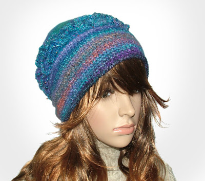
Here's a sample of how other TAFA artists on Etsy handle an analogous blue and purple color scheme:


