Tribal Jewelry from Central Asia on Afghan Tribal Arts
Great photos are key to successful online sales. And, that is one of the things that makes shopping on Etsy fun. The majority of the sellers there take this challenge seriously and really work at displaying their goods beautifully. Many other competing online markets fail dismally at this as products are displayed with boring, dull, dark, blurry and downright awful photos. There have even been jokes about photos on eBay where embarrassing reflections are caught by the camera and not noticed by the seller. The one that sticks in my mind is of a shiny, silver teapot reflecting the image of a fat white man with no shirt on looking through a camera. Bleah!
Of course there are awful photos on Etsy, too. Learning how to use lighting well and then edit photos is a time consuming process. Indira of dharmakarmaarts, one of our TAFA Team members, mentioned that she shoots dozens of shots for every item that she lists in her shop. Etsy only allows us to show five. I don't have Indira's patience, so I try for five to seven per item and go with the best. Over the years, I've photographed thousands of products. You would think that by now I would be an expert. I think I am about average. Good, but not exceptional. My goal is to give clear images of the product so that the potential buyer can see and "feel" what they are looking at. Sometimes I think photos on Etsy can go too far to the creative side, so that the product is actually diminished by the photo effects.
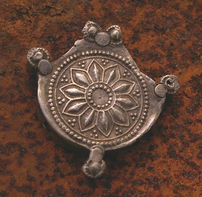
In the last couple of days, I have been working on getting photos ready for new listings on one of the shops I manage on Etsy, Afghan Tribal Arts. My friend, Abdul, imports from Afghanistan and we have textiles, beads and jewelry on his Etsy shop. I had started working on these photos a couple of months ago and then got sidetracked by other things. I normally shoot outside on overcast days and when I was setting up yesterday, my eye caught a rusty iron table that I have in my yard. I normally have plants on it. The surface has aged into some pretty cool looking textures, so I thought I would try re-shooting some things on it. Here is an example:
Before:
After:
The same pendant looks completely different on the white and rust background. The metals pick up reflections of the surface it is on. What do you think? Which do you like better? I love the rusty texture, but wonder if it makes the overall image too dark, especially when it is a small thumbnail. Here are some other examples:
I was also playing with placing the objects a bit off center...
I often get rid of the background completely which is more time consuming. Here is a textile that I will list later today:
Turkman Child's Ceremonial Vest
I think a white background is especially important for pieces that already have a lot of pattern or texture in them. But, one could as easily choose a solid color instead of white as the background. Part of the challenge is to try to create a signature with the photos so that when they show up in image searches, people start recognizing immediately what belongs to your shop. I hesitate to do that because it might brand an object, limiting it to a certain type of decor or group of people. This is always a challenge when photographing clothing. Some shoppers prefer to see clothing on someone while others prefer a mannequin or hanger.
If you are a shopper, what turns you on or off to a photo? What kinds of backgrounds do you prefer?
If you are a seller, what have you experimented with and what are your insights?


I love the rust background. I too am trying to improve my photos. It's a whole new art form and I'm learning as I go.
ReplyDeleteFantastic change! I love it! Thank you for sharing this very important post!Many of us are unsure as to the way we have to use or nor use backgrounds. I was trying all kinds of solutions and came up the the conclusion that for my fiber necklaces the best is just plain white background but it took me a lot of time, frustration and experiments to get to it. I find that for textiles the best option is to use white background and day light for best results.
ReplyDeleteLove the rust too - really enriches the jewelry. I know I need lots of work on my photos, but a stark white background just seems to run contrary to our colorful life here. Strong but overcast natural light is what works to get the colors right - now autumn is here, that's much more abundant. As long as the background does not compete with the item, I think texture adds interest to a shot.
ReplyDelete